When the Design Is to Blame, Not You
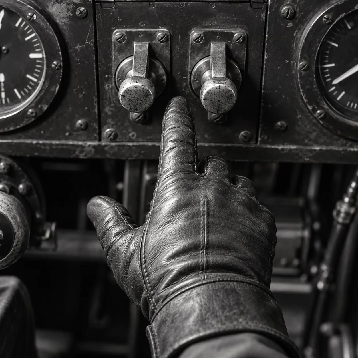
When many people make the same mistake, the design is usually the place to look. The lesson runs from 1947 cockpits to the dark patterns of shopping sites.
Key takeaways
- In 1947 Paul Fitts and R. E. Jones analysed 460 pilot-error experiences with aircraft controls; the lesson drawn from their report is that cockpit design caused many of them.
- A 2019 crawl of about 11,000 shopping sites by Arunesh Mathur and colleagues found 1,818 dark pattern instances in 15 types.
- In 2021 experiments by Jamie Luguri and Lior Strahilevitz, mild dark patterns more than doubled sign-ups and aggressive ones almost quadrupled them.
- Mathur's team found 22 third-party companies selling dark patterns to retailers as a ready-made service.
- A mistake many people make in the same place is information about the design, not the people.
You meant to cancel the subscription and somehow renewed it. You meant to decline the insurance and somehow bought it. Most people blame themselves: they were not paying attention, they clicked too fast. The history of design suggests a different question. When the same mistake happens to many people, the person is often not the one to blame. The design frequently is. Cliff Kuang and Robert Fabricant's User Friendly, a history of user-centred design, makes the case at book length, and names the reflex it is fighting. Putting the blame on the user, Kuang argues, is the most comforting explanation available, because it means the least has to change. The idea is older than the smartphone by sixty years.
1947, the pilots who were not to blame
During the Second World War, American military pilots kept making the same mistakes with aircraft controls, and the mistakes were recorded as pilot error. In 1947 the psychologist Paul Fitts and his colleague R. E. Jones, at the Aero Medical Laboratory at Wright Field in Ohio, analysed 460 such pilot-error experiences in operating aircraft controls.
They sorted the errors into types. Pilots used one control when they meant another. They moved a switch to the wrong position, forgot to operate a control, moved a control in the wrong direction, activated something by accident, or could not reach a control at all.
The conclusion that has carried down from the report, as later summaries describe it, is that many of these errors came from the design of the cockpit, and that equipment has to be built around the limits of the people using it. Calling them pilot error put the blame in the wrong place.
Another psychologist, Alphonse Chapanis, had noticed the same problem in bombers. As the psychologist Richard Pew later described it, Chapanis saw that the landing flaps and landing gear had identical switches placed side by side, which under stress pilots confused. The fix usually credited to him is giving the controls distinct shapes, so a pilot could tell them apart by touch. User Friendly credits Chapanis with anticipating, through those shape-coded knobs, an idea later central to design.
The lesson the field took is the one that matters here. When a mistake is common, frequent and predictable, the place to look is the thing being used, not the person using it.
2019, eleven thousand shopping sites crawled
The modern version of the problem is on screens, and it is sometimes deliberate. Designs that steer people into choices they would not otherwise make are known as dark patterns: a countdown that resets, a pre-ticked box, a cancellation page buried several clicks deep.
In 2019 a team led by Arunesh Mathur at Princeton measured how common these are. They built a program to crawl about 53,000 product pages from about 11,000 shopping websites and looked for text and design features associated with manipulation. They found 1,818 instances of dark patterns, falling into 15 types and 7 broader categories. They identified 183 websites engaging in practices they classed as deceptive, and 22 third-party companies offering dark patterns to retailers as a ready-made service.
Those 22 vendors are the closest modern parallel to the cockpit. A shopper who falls for a fake low-stock message on one site may meet the same message on another, supplied by the same vendor. The mistake is not an individual lapse. It is built into the page, and repeated across many pages. A crawl of this kind can only find what leaves a trace in a page's text and code, so it is likely to undercount rather than overcount.
2021, measuring what a dark pattern does
Counting dark patterns does not show that they work. That was tested by Jamie Luguri and Lior Strahilevitz, in experiments published in the Journal of Legal Analysis in 2021.
They ran two large experiments on representative samples of American consumers. In the first, people were offered a service, and the sign-up process used either no dark patterns, mild ones or aggressive ones. Mild dark patterns made people more than twice as likely to sign up as the control group, and aggressive ones almost four times as likely. In a working version of the paper, the first study had nearly 2,000 participants, and acceptance rose from about 11 per cent in the control group to about 26 per cent with mild patterns and about 42 per cent with aggressive ones.
Two further findings sharpen the picture. Aggressive patterns produced a backlash, with people more annoyed at the company, while mild patterns did not. And less educated participants were more susceptible to the mild patterns. In the second experiment, hidden information, trick questions and obstruction were the most effective techniques, while a message telling people they must act now did not work. The second experiment also varied the price, and the price made little difference. The authors concluded that the design of the choice, more than its cost, drove what people bought.
The design of the choice, more than its cost, drove what people bought.
The mild patterns are the ones to notice, because nobody thinks to blame them. They more than doubled sign-ups without making people angry. That is the combination that makes a design choice likely to survive: the company sees the gain, and the cost falls on customers who signed up for something they did not want.
Why the blame still lands on the user
If the evidence has pointed at design since 1947, why do people still blame themselves? Part of the answer is that a mistake feels personal. You clicked the button. Nobody forced your finger. The moment of error is yours, even if the conditions for it were arranged by someone else.
Part of it is that putting the blame on the user is convenient for everyone except the user. Kuang's point is that it is the comforting explanation, because it requires no redesign, no cost and no admission. A company that blames abandoned cancellations on customer confusion has no reason to simplify the cancellation page.
And part of it is that the line between persuasive design and deceptive design is not sharp. User Friendly treats dark patterns as a descendant of the same user-centred methods that made products easier to use, applied to a different goal. The tools that remove friction from a purchase can add friction to a cancellation.
The Fitts and Jones lesson cuts against all of this. A mistake that many people make in the same way is information about the design. It is not information about the people.
The cockpit comparison also shows what a fix looks like. Nobody solved the flap and gear problem by training pilots to concentrate harder. The controls were changed so the mistake became difficult to make. The equivalent for a screen is a cancellation that takes as many steps as the sign-up, a price shown in full on the first page, and a box that starts unticked. None of these is technically hard, and the experiments suggest why a business might still not make them: the confusing version earns more.
Nobody solved the flap and gear problem by training pilots to concentrate harder.
What to look for before you click
For readers, the practical value of the history is in recognising the pattern before the mistake. The checks below follow the categories the researchers measured.
Be suspicious of urgency that you did not create: timers, low-stock warnings and limited offers on sites where you were not in a hurry. Read the last screen before you pay, because hidden costs and pre-ticked additions sit there. When cancelling is harder than signing up was, treat the difficulty as part of the design rather than a sign that you are doing it wrong. And when a choice is worded as a question with a slightly odd phrasing, read it twice, because trick questions were among the most effective techniques in the experiments.
For anyone who designs or approves these pages, the 1947 report offers a simple test. Look at the mistakes your customers make most often. If many people make the same one, in the same place, the page is producing it. Fixing it may cost some sign-ups in the short run, but the experiments suggest the aggressive versions also produce resentment, and resentment is a poor foundation for a customer relationship.
Spotting the patterns is a defence, not a duty; responsibility stays with whoever built the page. When the same slip recurs across thousands of people, the design is the first place to look, and your own slip, rather than proving that you were careless, may be part of the evidence about how the page was built and who it was built to serve.
Common questions
What are dark patterns?
Design choices that steer people into decisions they would not otherwise make, such as hidden costs, pre-ticked boxes, fake urgency and hard-to-find cancellation. A 2019 crawl of about 11,000 shopping sites found 1,818 instances across 15 types.
Do dark patterns actually work?
Yes. In 2021 experiments by Jamie Luguri and Lior Strahilevitz, mild dark patterns made people more than twice as likely to sign up for a service, and aggressive ones almost four times as likely.
Where does the idea that design causes errors come from?
From wartime aviation. In 1947 Paul Fitts and R. E. Jones analysed 460 pilot-error experiences with aircraft controls and the conclusion carried down from their report is that cockpit design, not the pilots, explained many of them.
Sources
Fitts, P. M., & Jones, R. E. (1947). “Analysis of factors contributing to 460 pilot-error experiences in operating aircraft controls.” Memorandum report TSEAA-694-12, Aero Medical Laboratory, Air Materiel Command, Wright Field. Error categories as summarised in US DOT report DOT/FRA/ORD-07/10 (2007); the original was not read.
Pew, R. W. (2010). 'Alphonse Chapanis: pioneer in the application of psychology to engineering design.' APS Observer, 1 April 2010. https://www.psychologicalscience.org/observer/alphonse-chapanis-pioneer-in-the-application-of-psychology-to-engineering-design
Mathur, A., Acar, G., Friedman, M. J., Lucherini, E., Mayer, J., Chetty, M., & Narayanan, A. (2019). 'Dark patterns at scale: findings from a crawl of 11K shopping websites.' Proceedings of the ACM on Human-Computer Interaction, 3(CSCW). doi:10.1145/3359183.
Luguri, J., & Strahilevitz, L. J. (2021). 'Shining a light on dark patterns.' Journal of Legal Analysis, 13(1), 43-109. Two large-scale experiments on representative samples of American consumers. Mild dark patterns more than doubled the rate of signing up for a dubious service against control; aggressive ones made subscription almost four times as likely and produced a backlash that mild ones did not. Hidden information, trick questions and obstruction were the most effective techniques; must-act-now messages did not work. Where dark patterns were used, the price of the service became immaterial. doi:10.1093/jla/laaa006
Kuang, C., with Fabricant, R. (2019). User Friendly: How the Hidden Rules of Design Are Changing the Way We Live, Work, and Play. MCD / Farrar, Straus and Giroux. Read in full by this publication, with a reliability audit.
A note on scope: the checks for readers are this publication's suggestions, drawn from the categories the researchers measured.