Why We Read Quiet Logos as Status
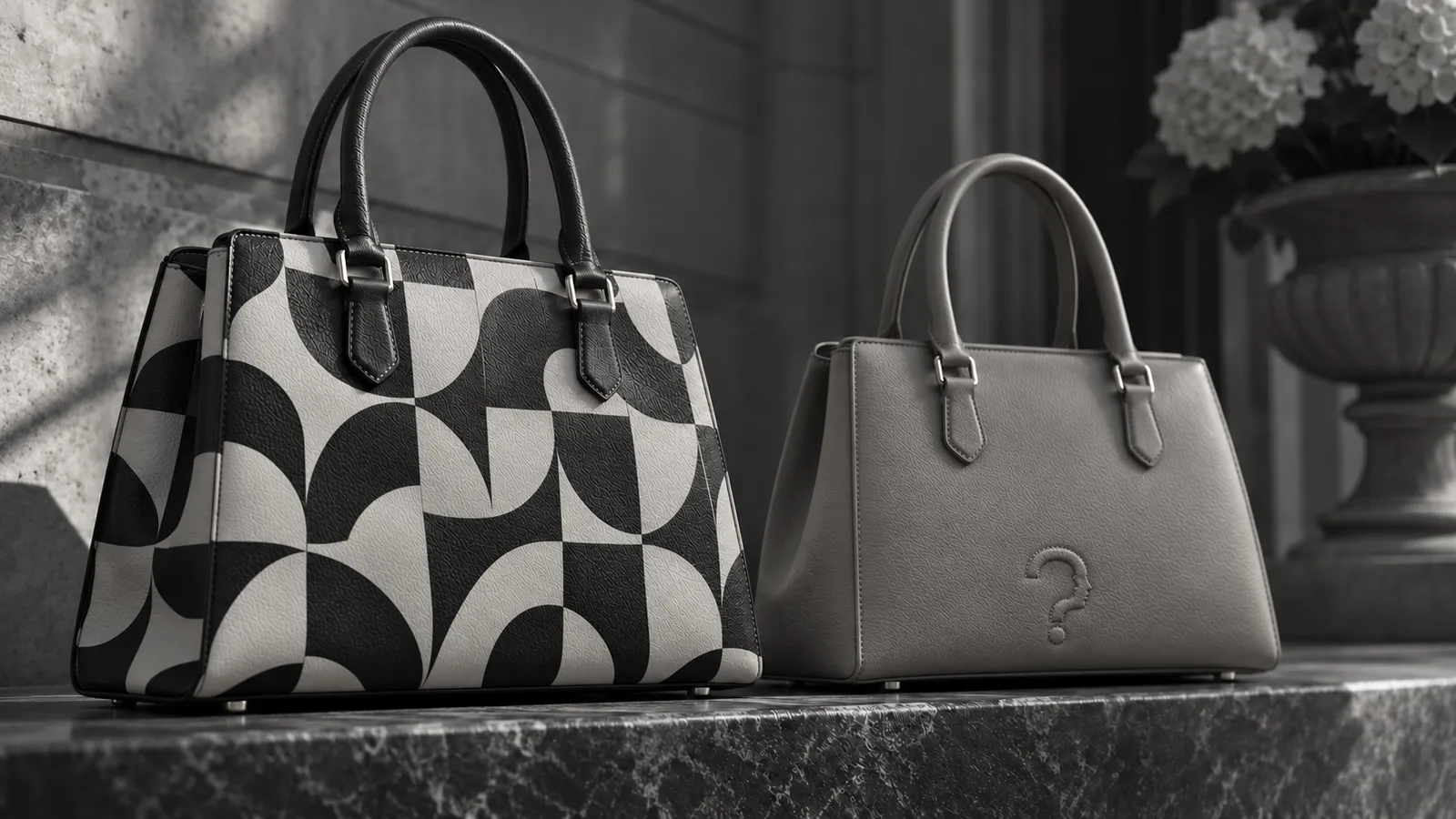
A contrast between loud and quiet branding, and what experiments on decoding, impression management and inconspicuous consumption say about who reads each.
Answer to the question
Why do quiet logos signal more status?
Because a logo's status depends on who can read it. In experiments by Jonah Berger and Morgan Ward, subtle markers were harder for observers to decode, while people who know the category used them to set themselves apart. A quiet logo signals more status to informed insiders and less to general observers.
Key takeaways
- Jonah Berger and Morgan Ward reported experiments showing that subtle brand markers are harder for observers to decode, so the products carrying them can be taken for cheaper ones.
- The authors explain the pattern through social identity: mainstream consumers favour explicit symbols, while people who know a category use subtle cues to set themselves apart and to signal to others in the know.
- Rosellina Ferraro, Amna Kirmani and Ted Matherly found in three studies that observers with little connection to a brand rated both the user and the brand less favourably after seeing conspicuous use, while observers with a strong connection kept a favourable view of the user.
- Giana Eckhardt, Russell Belk and Jonathan Wilson attribute the rise of inconspicuous consumption to diluted luxury signals, a preference for not appearing ostentatious in hard times, and a wish for subtle design that sets people apart from a narrow group of peers.
- Taken together, the research points to an audience-dependent signal: a quiet logo carries more status for informed insiders and less for general observers.
A logo works only for people who can read it, and that one fact explains most of the research on why quiet logos signal more status than loud ones. A large mark reaches everyone on the street. A small or absent one reaches the few who know where to look, and those few are often the audience the wearer cares about most. A wearer choosing a mark is choosing an audience, whether or not the choice feels deliberate. The status a quiet logo carries is therefore real but conditional on the audience, and experiments on branding, impression management and what researchers call inconspicuous consumption show how much the audience matters.
Loud marks reach strangers, quiet marks reach insiders
Thorstein Veblen's The Theory of the Leisure Class, first published at the end of the nineteenth century, supplies the oldest account of why visible goods carry messages at all. His argument turns on the audience. Among people who know one another's circumstances, little proof of wealth is needed. Among strangers, who cannot see how a household earns or spends, goods have to do the telling, and the more anonymous the crowd, the more weight the visible object carries.
Well over a century after Veblen's account, a large logo is the modern version of that logic: it hands a stranger across a street, or across a screen, a fact the stranger could not otherwise learn, and it asks nothing of the observer beyond recognising the name.
Veblen also described what happens when the audience narrows. In his account, a wealthy circle that grows large and confident enough to be its own audience develops finer ways of recognising its own members, and the plain advertisement of cost loses ground at the top. That is the idea of the quiet logo written more than a century before the term. It is an argument from economic theory and not a measurement, and the experimental work that followed tests parts of it.
Jonah Berger and Morgan Ward ran experiments on exactly this contrast and published them in the Journal of Consumer Research in 2010. High-end products often carry fewer clear markers than mass-market ones, and the experiments showed that subtle markers are harder for observers to decode, which means the products can be taken for cheaper ones. The authors explain the pattern through social identity and the wish for distinction. Mainstream consumers lean towards explicit symbols. People who know the category use subtle cues to set themselves apart from the mainstream and to speak to others who are in the know.
That finding answers the question in the title with a condition attached. A quiet logo signals more status to an observer who can decode it and less, sometimes none, to an observer who cannot. The same dependence on an informed viewer appears in research on deliberately breaking a dress code, which What is the red sneakers effect sets out.
A signal that everyone can read cannot separate insiders from the crowd, so a mark that fewer people can decode does work a widely decoded one cannot. The price of that arrangement falls on reach: the restraint that sets insiders apart also hides the object from outsiders, who may see only a plain product.
| Loud logo | Quiet logo | |
|---|---|---|
| Who can read it | Almost any observer | Observers who know the category |
| What it asks of the observer | Recognising the brand | Knowing cut, material or design cues |
| Audience reached | Wide | Narrow |
| Typical misreading | Seen as a bid for impression | Taken for a cheaper product |
| Research | Veblen; Ferraro, Kirmani and Matherly | Berger and Ward |
The loud mark, read by people who know the brand
A loud logo reaches more people, but reaching them is not the same as being read as intended. Rosellina Ferraro, Amna Kirmani and Ted Matherly ran three studies on conspicuous brand use, meaning use of a brand in attention-grabbing ways, and published them in the Journal of Marketing Research in 2013. Their account is that observers can attribute such use to impression management. Observers with little connection to the brand rated both the user and the brand less favourably after seeing it. Observers with a strong connection to the brand kept a favourable view of the user.
The reception of a loud logo therefore depends on a second audience variable beyond who can read it: how the observer feels about the brand. What the visible label actually buys the wearer is a separate question, which What the Luxury Label Actually Buys follows through a field experiment and its replication.
For a brand manager the useful question about a prominent mark is who is in the audience, and not whether the mark is large or small, because a loyal base and an unfamiliar crowd can see the same logo and take away different things. The loud logo buys reach and accepts a spread of readings. The quiet logo buys a precise reading from a small audience and accepts that most people will miss it.
The quiet mark grows as visible signals spread
Giana Eckhardt, Russell Belk and Jonathan Wilson set out the wider shift in a conceptual paper in the Journal of Marketing Management, drawing on a broad synthesis of the literature. They attribute the rise of inconspicuous consumption to three developments: the signalling ability of traditional luxury goods being diluted, a preference for not standing out as ostentatious in times of economic hardship, and a growing desire for sophistication and subtlety in design as a way of distinguishing oneself from a narrow group of peers. The authors separate the idea of luxury from the idea of conspicuousness, which leaves room for a luxury good that is deliberately hard to notice.
When many people carry the same visible mark, the mark says less about any one of them, and a signal that only a few can read recovers the distinction. Work on wealthy buyers with a low need for status, covered in Black in Branding: Luxury and Authority, fits that account.
Costly signalling theory, explained in What is costly signalling, usually puts the cost in money. A quiet logo moves part of the cost into knowledge, because reading it takes time spent learning a category. That shift is our interpretation of the studies and not a result any of them reported, but it accounts for the pattern all three papers share: the quieter the mark, the more the status depends on what the observer already knows, and the narrow group of peers Eckhardt and colleagues describe is the group that has learned to see it.
Common questions
Why do quiet logos signal more status?
Because a logo's status depends on who can read it. Subtle markers are harder for general observers to decode, and people who know the category use them to set themselves apart from the mainstream, so a quiet logo signals more status to informed insiders.
Do quiet logos always signal more status?
No. In the experiments by Berger and Ward, subtle markers were harder for observers to decode, so general observers could take a product for a cheaper one. The extra status appears among observers who know the category.
Is a quiet logo the same as no logo?
Not in the research. The studies compare how obvious a brand marker is, from large and explicit to small and subtle, and the subtle end still carries cues that informed observers can read.
Why do loud logos still sell?
They reach almost any observer, and observers who feel connected to the brand keep a favourable view of the user, according to Ferraro, Kirmani and Matherly. Reach is a real benefit when the audience is made of strangers.
Sources
Veblen, T. The Theory of the Leisure Class. Seed book; vault hub Books/The Theory of the Leisure Class.
Berger, J., & Ward, M. (2010). “Subtle signals of inconspicuous consumption.” Journal of Consumer Research, 37(4), 555-569. doi:10.1086/655445 https://doi.org/10.1086/655445
Ferraro, R., Kirmani, A., & Matherly, T. (2013). “Look at me! Look at me! Conspicuous brand usage, self-brand connection, and dilution.” Journal of Marketing Research, 50(4), 477-488. doi:10.1509/jmr.11.0342 https://doi.org/10.1509/jmr.11.0342
Eckhardt, G. M., Belk, R. W., & Wilson, J. A. J. (2015). “The rise of inconspicuous consumption.” Journal of Marketing Management, 31(7-8), 807-826. doi:10.1080/0267257x.2014.989890 https://doi.org/10.1080/0267257x.2014.989890