Ambient Colour
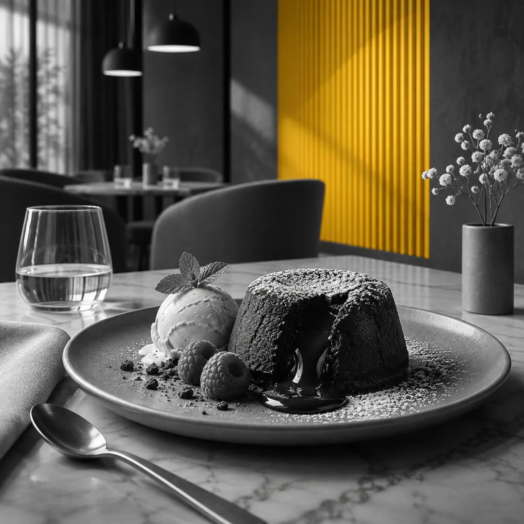
Ambient colour is colour in the surroundings of a purchase, such as a wall, as opposed to colour attached to the product itself, such as a plate, a cup or a label. The Why We Project uses the term for a 2024 paper in the Journal of Consumer Psychology by Courtney Szocs and colleagues, which found that red as ambient colour pushed food choices in a different direction from red attached to the food.
What it is
The distinction matters because the same hue can carry different meanings depending on where it sits. The 2024 paper starts from earlier research showing that red tied directly to a food product, on nutrition labels, plates or cups, led people to avoid indulgent foods. The authors then note that red is also common in the surroundings of eating places, which suggests that in the context of food and eating, ambient red may mean something different from product-related red.
The paper's answer is that the placement of red changes its meaning. Colour on the food is read as a signal about the food. Colour on the wall is read as a signal about the kind of place a person is in.
In effect
In the 2024 paper, consumers associated ambient red, for example a wall colour, with restaurants that serve indulgent food. The presence of ambient red, against blue, grey or white, led to a greater preference for high-calorie, high-fat and indulgent options. The authors explain this as an inference: consumers draw on ambient cues to work out what a retail establishment sells and then choose the products that suit the setting.
The effect was not uniform. It depended on how strongly a consumer linked red with restaurants of that kind, so a person with a weak link showed less of the shift.
The Red in Branding article sets this result beside a 2012 pair of studies in which people drank less from a red labelled cup and ate less snack food from a red plate than from blue or white ones. Read together, the two sets of results show red working through what it signals in the setting, which is the point of the colour-in-context view.
What it does not say
The concept does not say that red walls raise hunger, and it does not describe how much anyone eats. The abstract of the 2024 paper reports preference and choice, and it compares red with blue, grey and white only. It does not claim that other colours behave differently in other settings, and it does not describe any particular business.
Sources
- Szocs, C., Abell, A., Ruzeviciute, R., Kim, Y., & Biswas, D. (2024). Contextual effects of color on food choices: Red ambient color induces indulgence. Journal of Consumer Psychology. https://doi.org/10.1002/jcpy.1445
- Genschow, O., Reutner, L., & Wanke, M. (2012). The color red reduces snack food and soft drink intake. Appetite, 58(2). https://doi.org/10.1016/j.appet.2011.12.023