Colour as a Trust Cue
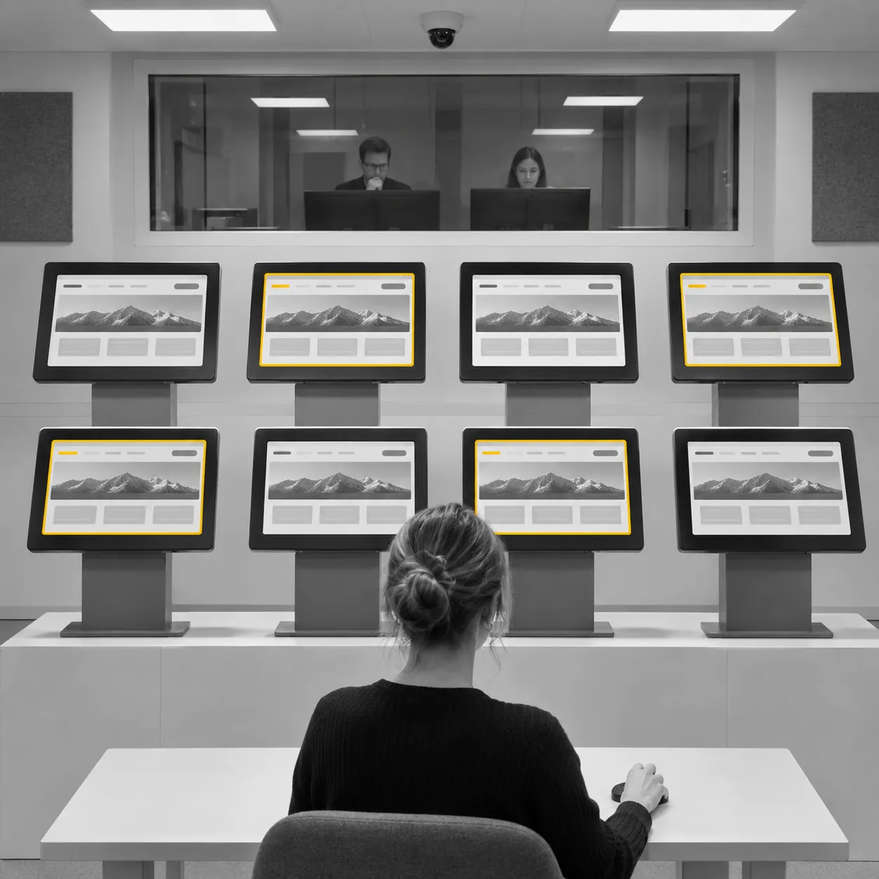
Colour as a trust cue is the idea that the colour scheme of a website or brand nudges how trustworthy it looks to a stranger. The most direct test on this site is a 2011 experiment in which more than 200 people rated eight websites that were identical apart from colour scheme. Colour had a statistically significant but limited effect on perceived trustworthiness. The authors judged it small beside everything else that leads people to trust a site, and they reported blue as the most trusted scheme and black as the least.
What it is
A cue is a small, quickly read signal that people use when they cannot check the underlying facts. A visitor to an unfamiliar site cannot inspect the organisation behind it, so first impressions rest on what is visible, and the colour scheme is one visible element among layout, wording, images and sector. Colour as a trust cue names the claim that this one element carries information about trustworthiness, or at least changes the impression of it.
The claim matters for branding because colour is among the cheapest design decisions to change. If a scheme could lift trust on its own, it would be a very efficient lever. The research reviewed here suggests the lever is real but short.
The concept is separate from two neighbouring ideas on this site. Colour-emotion associations describe the feelings people link with colour terms in general. Ecological valence describes why a colour is liked. Colour as a trust cue concerns a narrower outcome, a judgement of whether an organisation can be relied on, and it is measured by asking people to rate what they see.
In effect
The study behind the concept was published by Wouter Alberts and a co-author in Technical Communication in 2011. Its participants, more than 200 in number, rated eight websites drawn from three sectors, finance, legal and medical. Each respondent saw sites that were identical in every respect except colour scheme, which removes layout, wording and sector as explanations for any difference. Four schemes were tested: red, blue, green and black.
The authors considered the sector of the website because the emotions linked with colours may vary with context. The result was a statistically significant but limited effect of colour on perceived trustworthiness, compared with all the other factors that lead people to trust a site. Blue was the most trustworthy scheme and black the least. The authors described the effect as significant but very small, and presented the work as the first demonstration of a link between colour and trustworthiness on websites, one that supports a common design intuition.
Green was one of the four schemes. The concept therefore applies to green as a member of a set, and the headline result concerns the ends of the range.
In the Why We Project article on green color psychology, the result is read as follows: colour registers with people and moves trust only a little. A brand that expects green alone to raise trust asks more of the colour than this study found. A brand that disregards colour disregards a cue that people do register.
What it does not say
The study is one experiment, and this page rests on its abstract. It tested websites, so it does not speak directly to logos, packaging or advertising. It tested four schemes, so it does not rank every hue. It reports an effect on rated trustworthiness, which is a judgement of how a site looks, and it does not follow people into a decision to use or buy.
A wider review of the field, by Andrew Elliot and a co-author in 2014, concludes that colour can carry meaning and can influence affect, cognition and behaviour, and also that the field is still early. Boundary conditions, moderators and whether findings hold in real-world settings need study before firm practical recommendations are justified. The same caution applies here: the website result is a measured, small effect in one setting.
Sources
- Alberts, W. A., & van der Geest, T. M. (2011). Color matters: Color as trustworthiness cue in web sites. Technical Communication, 58(2).
- Elliot, A. J., & Maier, M. A. (2014). Color psychology: Effects of perceiving color on psychological functioning in humans. Annual Review of Psychology, 65(1). https://doi.org/10.1146/annurev-psych-010213-115035
- Norman, D. The Design of Everyday Things.