Colour Expectation Effect
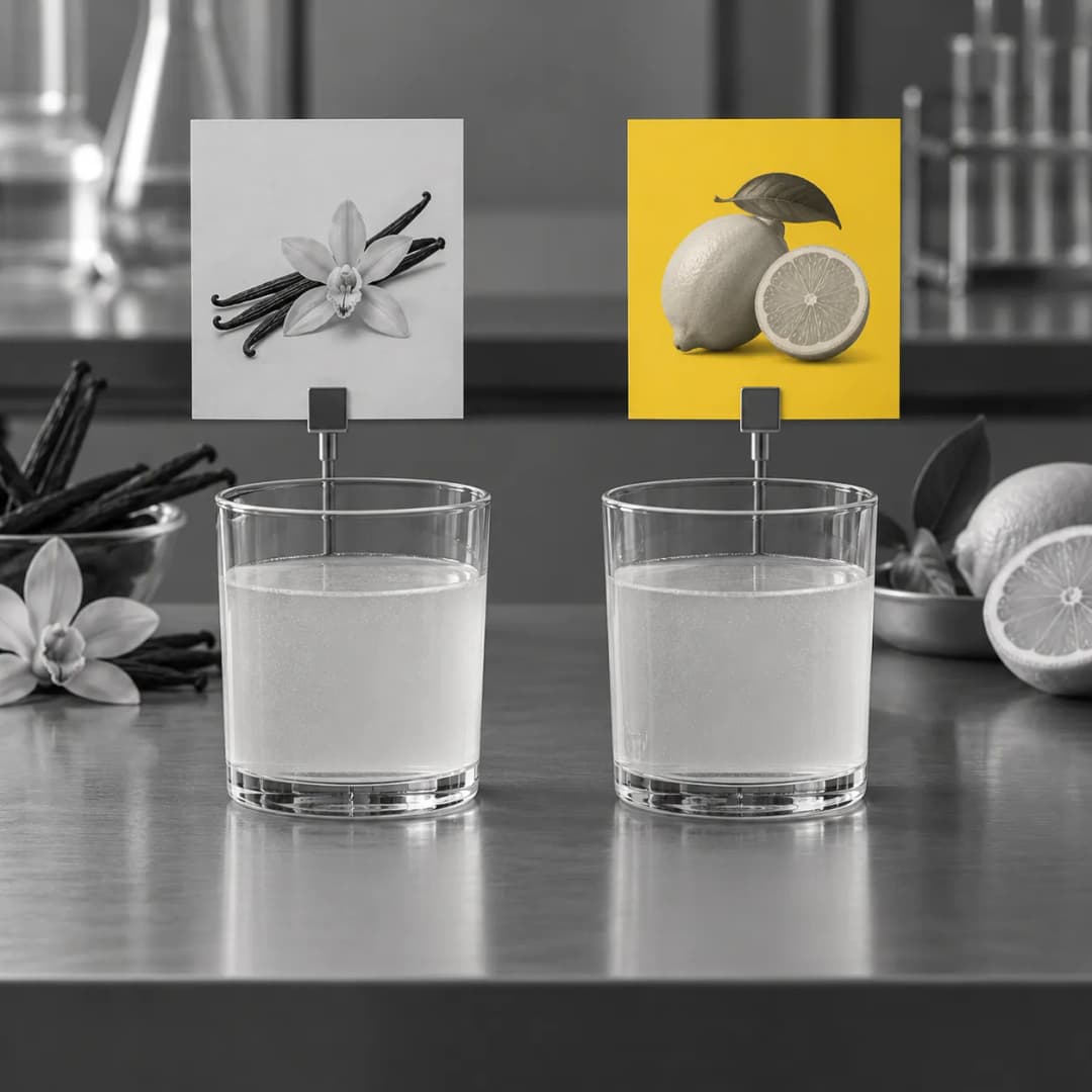
The colour expectation effect is the tendency to read food in line with the colour it is expected to have, so that a colour cue changes what a person predicts they will taste. Where the colour matches the taste, the expectation carries through into the experience. Where it does not, the result is a disconfirmed expectation, which Charles Spence's group describes as a negative reaction. The effect is about flavour prediction. It is not evidence that a colour makes anyone hungry.
What it is
Charles Spence's 2015 review in Flavour, "On the psychological impact of food colour", states the idea in its abstract. Colour is probably the most influential product-intrinsic cue for predicting how food and drink will taste. Laboratory studies show that altering a food's hue, intensity or saturation can strongly shape expectations and, through them, what people experience. When colour does not match taste, the mismatch can produce a negative reaction.
Two qualifications travel with the idea in the same abstract. The meaning of a food's colour differs across age groups and cultures, and genetic traits such as taster status can change how colour affects flavour perception. A palette that tells everyone what a colour means is therefore not what the literature offers.
Spence's wider programme sits under crossmodal correspondences, the associations that run between one sense and another. Seeing a colour sets up a prediction in another sense, taste, before the first mouthful.
The vault also holds an older, less checked version of the claim from a consumer behaviour textbook. It reports a 1987 study by G. Tom and colleagues in which a university-student sample accepted dark brown vanilla pudding as chocolate, and the darkest version was rated as having the best chocolate flavour. This site has confirmed that the paper exists in the Journal of Consumer Marketing but has not read the figures against it, so the textbook's percentages are not used.
In effect
The best-documented demonstrations are with drinks and crockery, and they are covered in Why Your Coffee Tastes Different in a White Cup.
George Van Doorn, Dianne Wuillemin and Spence, writing in Flavour in 2014, served café latte from transparent, white or blue mugs. In the first experiment the white mug made the coffee read as more intense. Because the mugs differed slightly in shape, they repeated the work with identical glass mugs in coloured sleeves, and the effect held: the coffee was rated less sweet from the white mug than from the transparent or blue ones. Contrast is their proposed explanation, since a white mug changes how brown the coffee looks.
Vanessa Harrar and Spence varied the weight, size, shape and colour of plastic cutlery and found that the colour of the cutlery moved taste ratings only in combination with the colour of the food.
Betina Piqueras-Fiszman, Agnès Giboreau and Spence tested three desserts on white or black plates in a working restaurant, with each diner seeing only one plate. Plate colour significantly influenced how the food was perceived, the size of the shift varied by dessert, and associations such as black with intense chocolate seemed to carry part of it.
In each case what moves is a rating of taste or intensity from people who are about to eat. None of these studies measured hunger.
What it does not say
It does not say that colour makes people hungry. The effect concerns what people predict about flavour. This site separates it from the Colour-Appetite Claim for that reason.
It does not say there is a wavelength that means sweet. The same white mug that suppresses sweetness in coffee can do something different with a pale dessert, because the contrast reverses. The effect depends on how the food looks against its background and on what the person has learned to expect.
It does not say the effect is uniform. Spence's own review notes differences by age, culture and taster status, and the plate study found shifts of different sizes for different desserts.
It does not rest on the pudding figure. The textbook's account of the 1987 pudding study is unchecked on this site.
It does not tell anyone how to choose crockery, packaging or paint. The findings describe laboratory and restaurant ratings, not sales.
Sources
- Spence, C. (2015). 'On the psychological impact of food colour.' Flavour, 4, 21. doi:10.1186/s13411-015-0031-3. Abstract read.
- Van Doorn, G., Wuillemin, D., & Spence, C. (2014). 'Does the colour of the mug influence the taste of the coffee?' Flavour, 3, 10. As used in article 25 on this site.
- Harrar, V., & Spence, C. (2013). 'The taste of cutlery: how the taste of food is affected by the weight, size, shape, and colour of the cutlery used to eat it.' Flavour, 2, 21. As used in article 25.
- Piqueras-Fiszman, B., Giboreau, A., & Spence, C. (2013). 'Assessing the influence of the color of the plate on the perception of a complex food in a restaurant setting.' Flavour, 2, 24. As used in article 25.
- Tom, G., Barnett, T., Lew, W., & Selmants, J. (1987). 'Cueing the consumer: the role of salient cues in consumer perception.' Journal of Consumer Marketing, 4(2), 23-27. Existence confirmed; figures unchecked.
- Vault record: first encountered 2026-10-21 in Consumer Behaviour; evidence status primary-cited (re-rated 2026-10-24 on the abstract and studies read; the textbook pudding figure is not relied on); extended 2026-10-24 by Does Yellow Really Make People Hungry.