Front-of-Pack Symmetry
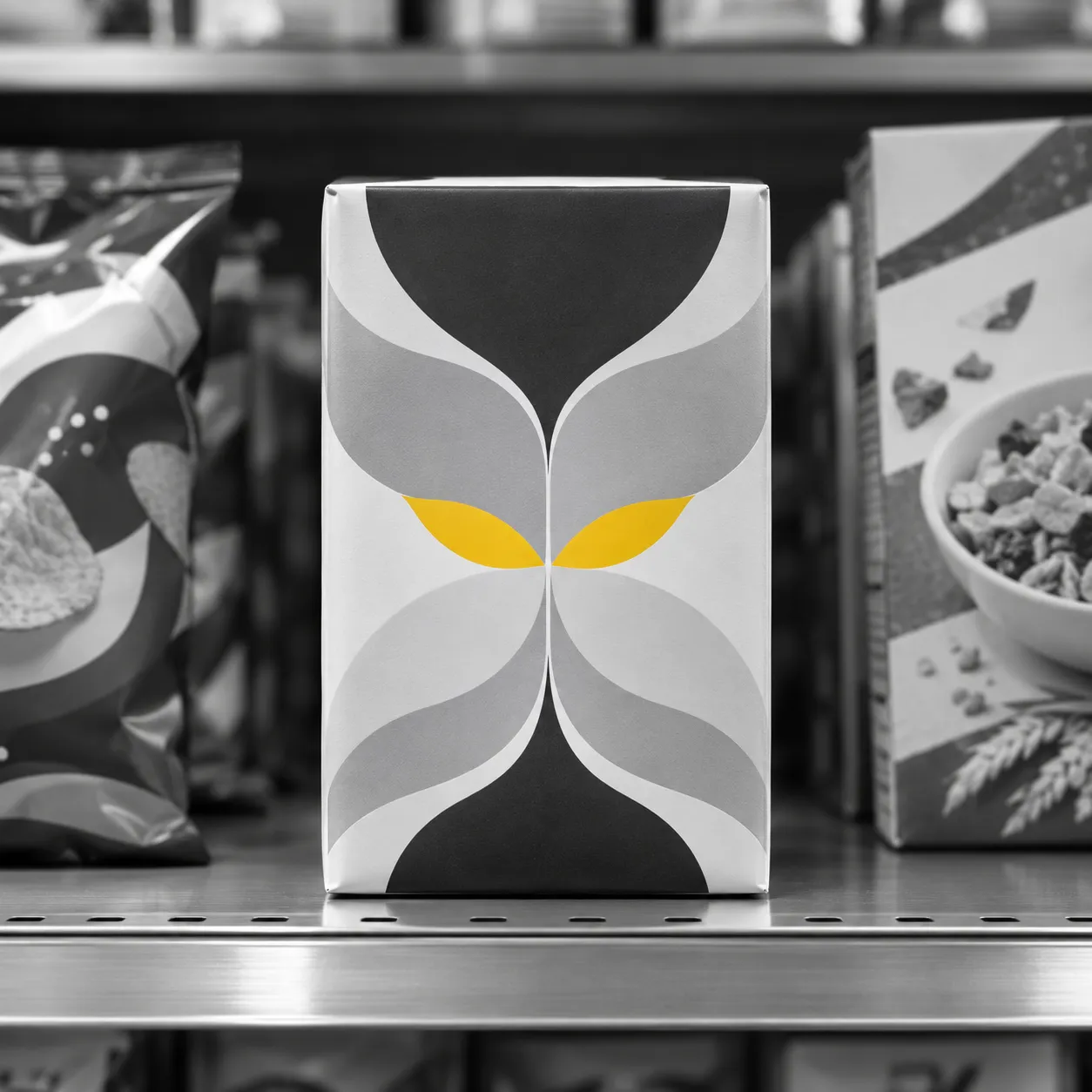
Front-of-pack symmetry is a mirror-symmetric arrangement of the information on the front of a pack around the vertical axis. A 2018 experiment found it lowered perceived visual complexity.
What it is
A pack front carries a name, a picture and often several claims. How those elements are placed is a layout decision, and one option is to arrange them so that the left and right halves mirror each other around a vertical line.
Arnaud Bigoin-Gagnan and Sophie Lacoste-Badie tested that option in a 2018 paper in the International Journal of Retail and Distribution Management. They asked whether a symmetric arrangement of front-of-pack information affects how complex the pack looks, how easily it is processed and how people respond to it.
In effect
The experiment was within-subject: 104 participants were exposed to fast-moving consumer goods packaging. A mirror-symmetric layout around the vertical axis lowered perceived visual complexity. Lower complexity in turn raised processing fluency, the ease with which a pack is taken in, although the mediation was indirect only.
Symmetry also had a positive influence on aesthetic evaluation and on purchase intention.
The finding concerns the arrangement of information already on the front. For a brief, it suggests asking the designer to show a symmetric version beside the current one. That is an interpretation by this site.
What it does not say
Purchase intention is a stated intention, not a purchase, so the experiment does not show that a symmetric layout changes sales.
The abstract describes one experiment on fast-moving consumer goods packaging, and this page makes no claim about other product types or about how much information a front can carry.
Sources
- Bigoin-Gagnan, A., & Lacoste-Badie, S. (2018). Symmetry influences packaging aesthetic evaluation and purchase intention. International Journal of Retail & Distribution Management, 46(11/12). https://doi.org/10.1108/ijrdm-06-2017-0123