Luminance Contrast
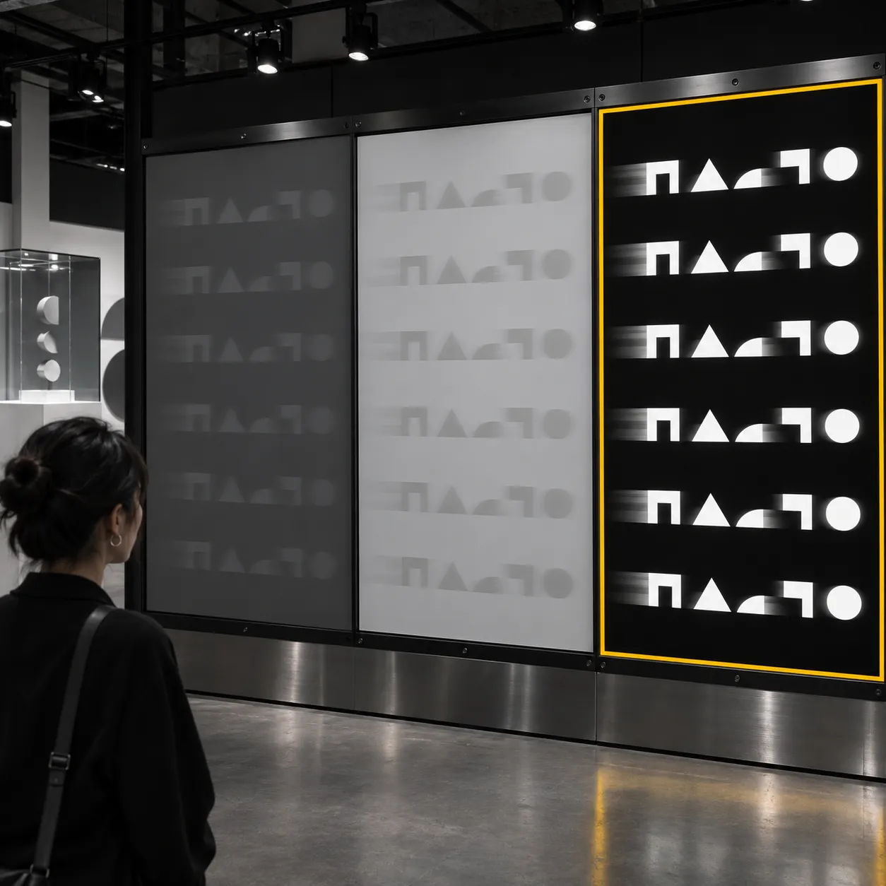
Luminance contrast is the difference in lightness between a piece of text and the ground behind it, as opposed to a difference in hue. In a 1991 study of reading drifting text, Kenneth Knoblauch, Aries Arditi and Janet Szlyk found that adding a small luminance contrast made reading rates unaffected by chromatic contrast across a thirty-fold range of character sizes.
What it is
Text can stand apart from its background in two ways. It can be lighter or darker than the ground, which is luminance contrast, or it can differ in hue and colourfulness while sitting at a similar lightness, which is chromatic contrast. The two can come apart. A pair of colours can look clearly different and still be close in lightness.
This matters for any light colour used as type. Yellow is a light colour, so yellow type on a white or pale ground leaves little lightness difference, while yellow as a ground behind dark type leaves a great deal. That application to yellow is the reasoning of the article Yellow in Branding: Optimism, Attention and Risk, and the study itself does not report it.
In effect
Knoblauch, Arditi and Szlyk measured reading performance for drifting text defined by chromatic contrast and by luminance contrast. Adding a small luminance contrast meant that reading rates were no longer affected by the amount of chromatic contrast, and this held across a thirty-fold range of character sizes. Near threshold, reading rates approached 300 words per minute. The authors suggest that low-pass filtering affects small characters more than large ones, and that reading text with no lightness difference at all may depend on transients produced by the eye's transverse chromatic aberration.
A practical point of the same kind appears in advertising. David Ogilvy argued in Ogilvy on Advertising that readers are lost when type is set in reverse or laid over a picture, and he reports tests of his own that favoured black type on white. His tests are his own reports and not published experiments. The vault's concept on typographic legibility records the same advice.
What it does not say
The study used drifting text under laboratory conditions and measured reading rates. It did not test yellow, brands, packaging, web pages or purchases, and it does not say that a particular colour pair is unreadable. The conclusion that yellow type on a pale ground deserves a lightness check is an inference from the mechanism, and a brand that cares about it would want to measure its own colour pair.
Sources
- Knoblauch, K., Arditi, A., & Szlyk, J. (1991). Effects of chromatic and luminance contrast on reading. Journal of the Optical Society of America A, 8(2), 428. https://doi.org/10.1364/josaa.8.000428
- Ogilvy, D. (1983). Ogilvy on Advertising.