Do Hard-to-Read Fonts Help or Hurt
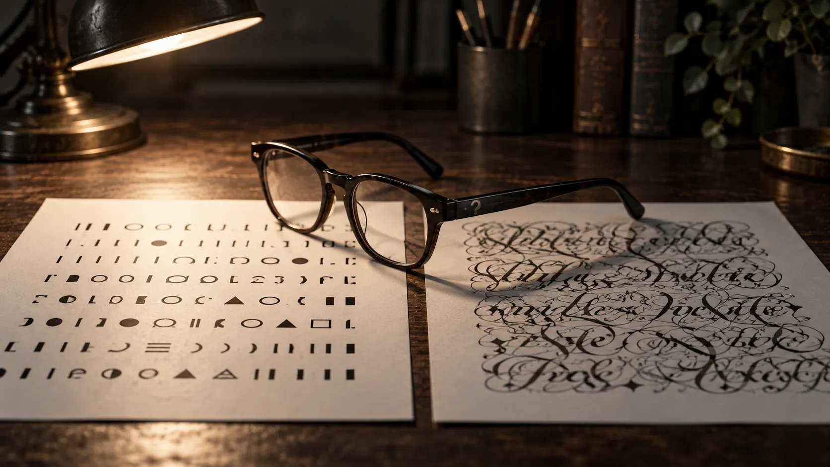
Hard-to-read fonts were said to sharpen reasoning and improve learning. Both claims failed when other laboratories ran them again, while a separate finding about how readers judge the writer has been tested far less.
Answer to the question
Do hard-to-read fonts help or hurt?
Mostly neither. Hard-to-read fonts did not improve reasoning in 16 replication attempts, and the learning studies since 2011 have generally found no benefit. A 2006 series of experiments found that readers judged authors writing in hard-to-read fonts as less intelligent, a result that has not had a replication programme of the same size.
Key takeaways
- Kahneman reports that 90 per cent of students made at least one error on a three-question reasoning test in a normal font and 35 per cent in a barely legible one. The finding traces to Alter, Oppenheimer, Epley and Eyre (2007).
- Meyer and nine co-authors (2015) pooled the original with 16 replication attempts and found no effect on solution rates. Sirota, Theodoropoulou and Juanchich (2021) found none in 310 participants, whatever their numeracy.
- Diemand-Yauman, Oppenheimer and Vaughan (2011) reported better learning from harder fonts, with 28 volunteers and 222 pupils. Six studies in a 2016 set generally did not find it, and Taylor and colleagues (2020) found no memory benefit from Sans Forgetica in four experiments.
- Oppenheimer (2006), in five experiments, found that text in hard-to-read fonts led readers to rate the author as less intelligent. Giving readers an irrelevant explanation for the difficulty reduced their reliance on the feeling.
- Sirota and colleagues' second experiment, with 311 participants, found that telling people to reflect on the problems raised solution rates substantially. The lever was in the task, not the typeface.
Hard-to-read fonts were once said to make people think harder. Kahneman's Thinking, Fast and Slow reports a reasoning test printed in small, washed-out grey type, and the students who struggled to read it made fewer mistakes than those who read it in an ordinary font. The result came out of Princeton, and the explanation was easy to repeat.
In Kahneman's account, 40 students took a three-question test and half of them read it in the bad font. Of those who read the normal font, 90 per cent made at least one error. Of those who read the barely legible one, 35 per cent did. He reports that the bad font produced the better performance. His endnotes cite the original paper, by Alter, Oppenheimer, Epley and Eyre, published in 2007 in the Journal of Experimental Psychology: General.
Hard-to-read fonts have since been credited with three effects. They were said to sharpen reasoning, to improve learning, and to cost a writer the reader's good opinion. The first two failed when other laboratories tried them. The third has a different origin and has been tested far less, as the ledger shows.
| Claim | Where it started | What followed |
|---|---|---|
| Hard-to-read fonts sharpen reasoning | Alter, Oppenheimer, Epley and Eyre (2007); 40 students in Kahneman's account | Pooled with 16 replication attempts, no effect on solution rates (Meyer and colleagues, 2015); a further 310 participants showed none (Sirota and colleagues, 2021) |
| Hard-to-read fonts improve learning | Diemand-Yauman, Oppenheimer and Vaughan (2011); 28 volunteers and 222 pupils | Six studies in 2016 generally found no benefit, per Bjork and Yue; four Sans Forgetica experiments found none (2020) |
| Hard-to-read fonts lower an author's standing | Oppenheimer (2006); five experiments | The replication programmes tested other outcomes; none of that scale for this one |
A hard-to-read font cut errors in the original result, which later replications did not reproduce.
How the Reasoning Claim Travelled Through Two Books
Adam Alter carried the same finding into his own book. Drunk Tank Pink (2013) presents it as part of the fluency research that Alter ran himself: type that is hard to read makes people reason more carefully. The explanation was easy to repeat. A struggle with the page works like an alarm, the reader concludes that the material needs care, and slower, more careful thinking follows.
Kahneman's pages around the result name no critic and attach no replication caveat to it. A drop in errors from 90 to 35 per cent, produced by changing the print on a page, is a very large effect for a cheap manipulation, and that size is part of what made the claim travel. It is also what made it worth running again.
Seventeen Attempts, No Effect on Solution Rates
In 2015 a team of ten researchers led by Andrew Meyer pooled the original experiment with 16 replication attempts, in the same journal that had published the first paper. Solution rates did not differ between the fonts. The team also checked whether cognitive ability, the format of the presentation or the setting of the experiment made a difference, and found no benefit from the hard font under any of them.
Pooling matters here. The original result becomes one of seventeen, and the pooled result showed no effect. Hard-to-read fonts did slow responses slightly, and the authors found little evidence that the extra time reflected analytic reasoning. People read the awkward print more slowly, and the slower reading did not turn into better answers.
A single failed replication can fail for ordinary reasons, such as a small sample or altered materials, so the pooled design carries more weight than any one null. The original and the replications went into the same comparison, and the question was whether the font effect survived it. It did not.
A later study asked whether low numeracy had hidden the effect. Sirota, Theodoropoulou and Juanchich tested 310 participants and found that hard fonts did not improve solution rates on numerical problems whatever people's numeracy, and did not improve them on verbal problems either. Their updated meta-analysis of 18 comparisons put the effect at essentially zero.
Did the Classroom Result Hold Up?
The learning claim began in a laboratory and moved into a school. According to a summary hosted at Princeton, Diemand-Yauman, Oppenheimer and Vaughan (2011, Cognition) first had 28 volunteers learn material about extraterrestrials. Those who read an easy font answered 72.8 per cent of questions correctly, against 86.5 per cent for those who read a harder one.
The authors then randomly assigned 222 high-school students in Chesterland, Ohio, to easy or harder fonts across history, English, physics and chemistry, and the harder-font group did better on regular classroom tests. The authors added a warning: a font could become hard enough to block learning, and students who are easily discouraged might give up. The abstract of the Cognition paper confirms the outline, a laboratory study followed by a classroom one with better memory for the harder-to-read material, but the figures above are the Princeton summary's and are reported as it gives them.
Replication did not follow the headline. In 2016 the journal Metacognition and Learning published a set of studies on the question, and Bjork and Yue's commentary on them reports that the six studies generally failed to find the benefits the 2011 paper described. Sidi and colleagues found in two experiments that the medium mattered: a disfluent font helped success on computers and hurt it on paper. Rummer and colleagues ran three experiments and found no effect of disfluency. Eitel and Kühl found none on retention or transfer.
The Null Result and Its Arithmetic
A 2018 meta-analysis by Xie, Zhou and Liu pooled the text-based studies under a title that states its answer: no effects of perceptual disfluency on learning outcomes in text-based educational settings. Weissgerber, Brunmair and Rummer (2021) then went back through its numbers. They found coding and sign errors, effect sizes they could not reproduce and moderators that had been misclassified, and they concluded that it is still unknown whether the 2018 results are null and void.
The corrections did not revive a benefit. For transfer, the estimates stayed close to zero whichever way the errors were fixed. For recall the problems were larger, and the authors did not produce a corrected figure. A fair reading is that the meta-analysis is less reliable than its title, while the individual replications still stand.
The dispute is about arithmetic, and it is worth keeping apart from the dispute about the effect. Errors in a pooled estimate can be fixed by recomputing it. Individual experiments that found nothing cannot be repaired that way. The 2016 studies and the Sans Forgetica experiments are individual tests, and they reach the same place without leaning on the 2018 figure.
Sans Forgetica gives the clearest single test. It is a typeface designed to be hard to read, on the theory that a difficulty can help learning, a theory Robert Bjork named desirable difficulties in 1994. Taylor, Sanson, Burnell, Wade and Garry (2020, Memory) compared it with Arial across four experiments. Readers found Sans Forgetica harder to read, and it did not improve their memory. Sometimes their recall was worse.
Bjork and Bjork's 2020 account of the idea explains why the font may be the wrong kind of difficulty. They define desirable difficulties as challenges that trigger encoding and retrieval processes, and they note that a challenge becomes undesirable when the learner lacks the background to meet it. A font alters the look of the page. It does not ask the learner to retrieve or reorganise anything.
The Writer Pays for the Font
The third claim predates both of the others and runs in another direction. In five experiments in Applied Cognitive Psychology in 2006, Oppenheimer asked what readers conclude about an author from the way a text reads. In the first three experiments he varied the complexity of the writing, using longer and more elaborate words, and readers judged the author of the more complex text as less intelligent, whatever the quality of the essay. How easily the text could be processed carried the effect.
In the fourth experiment he changed only the font. Text in hard-to-read fonts led to judgments of a less intelligent author. In the fifth, readers were given an obvious but irrelevant cause for the difficulty, and they relied on the feeling less when judging the author. Some corrected so far that the bias ran the other way. The penalty attaches to an unexplained feeling of effort, and an explanation takes it off.
The mechanism is the general one set out in the 2004 review by Reber, Schwarz and Winkielman: the more fluently something is processed, the more positive the response to it, and people draw on that feeling when judging things that have nothing to do with reading, including whether a statement is true. On that account, a reader who finds a text hard going is left with a feeling that needs an owner, and the writer is the nearest candidate.
The two findings share an author, a decade and a manipulation, which is why the failure of one is easily taken to cover the other. It does not. The replications of the reasoning claim measured solution rates on problems, and this claim concerns readers' ratings of a writer, an outcome none of the learning studies above were built to measure. I could not find a replication programme of Meyer's scale for the 2006 paper, which is a reason to hold it loosely and no reason to treat it as refuted.
A third result from the same circle sits close by. Song and Schwarz (2008, Psychological Science) gave people exercise instructions in Arial or in Brush Script MT, a slanted, cursive-like typeface. With the harder font, readers rated the activity as more difficult, expected it to take longer and said they were less willing to make it part of their daily routine. The University of Michigan's account of the study gives no sample sizes or figures, so how large the shift was cannot be reported here. Schwarz also co-wrote the 2004 review of fluency research that sets out the mechanism behind this result and the 2006 one.
Which Typeface a Designer Should Choose
For anyone choosing a typeface, the replications settle the practical question better than the original claims did. Setting a brief, a slide or a revision guide in a hard-to-read font does not make readers reason harder or learn more, and in some of the studies it did a little harm.
That makes legibility the safe default and not a style preference. If a difficulty is to help anyone learn, Bjork and Bjork's definition puts it in the task, where the learner has to retrieve or reorganise something. Sirota and colleagues' second experiment, with 311 participants, points the same way: simply instructing people to pay attention to and reflect on the verbal problems raised solution rates substantially, which is a lever in the task and not in the typeface.
Where hard type does leave a mark is in expectation. In the Song and Schwarz study, recall of the instructions was the same in both typefaces, so readers took in the same exercise either way and still came away expecting a harder, longer and less appealing routine from the version set in the awkward script, a gap between what is understood and what is felt that the studies which measured performance did not look for.
Common questions
Do hard-to-read fonts help or hurt?
Neither, as a general rule. Hard-to-read fonts did not improve reasoning in 16 replication attempts and have not reliably improved learning, and in one set of Sans Forgetica experiments recall was sometimes worse. A separate 2006 series found that readers judged authors writing in hard-to-read fonts as less intelligent.
Do hard-to-read fonts help you remember?
Not on the evidence reviewed here. Four Sans Forgetica experiments found no memory benefit, and a 2016 set of six studies generally failed to find the gains reported in 2011. A meta-analysis reaching the same conclusion has itself been questioned for coding errors.
Do hard-to-read fonts make people think harder?
No. Meyer and colleagues pooled the original 2007 experiment with 16 replication attempts and found no effect on solution rates. They also tested cognitive ability, presentation format and experimental setting as possible moderators, and the hard font gave no benefit under any of them. The original result is the one Kahneman reports in his book.
Sources
Alter, A. (2013). Drunk Tank Pink: And Other Unexpected Forces That Shape How We Think, Feel, and Behave. New York: Penguin Press. Seed book; vault hub Books/Drunk Tank Pink.
Kahneman, D. (2011). Thinking, Fast and Slow. New York: Farrar, Straus and Giroux. Source of the font and reasoning-test result.
Alter, A. L., Oppenheimer, D. M., Epley, N., & Eyre, R. N. (2007). “Overcoming intuition: Metacognitive difficulty activates analytic reasoning.” Journal of Experimental Psychology: General, 136(4), 569-576. doi:10.1037/0096-3445.136.4.569 https://doi.org/10.1037/0096-3445.136.4.569
Meyer, A., Frederick, S., Burnham, T. C., Guevara Pinto, J. D., Boyer, T. W., Ball, L. J., Pennycook, G., Ackerman, R., Thompson, V. A., & Schuldt, J. P. (2015). “Disfluent fonts don't help people solve math problems.” Journal of Experimental Psychology: General, 144(2), e16-e30. doi:10.1037/xge0000049 https://doi.org/10.1037/xge0000049
Sirota, M., Theodoropoulou, A., & Juanchich, M. (2021). “Disfluent fonts do not help people to solve math and non-math problems regardless of their numeracy.” Thinking & Reasoning, 27(1), 142-159. doi:10.1080/13546783.2020.1759689 https://doi.org/10.1080/13546783.2020.1759689 (updated meta-analysis of 18 comparisons: Hedges' g of minus 0.01).
Diemand-Yauman, C., Oppenheimer, D. M., & Vaughan, E. B. (2011). “Fortune favors the bold (and the italicized): Effects of disfluency on educational outcomes.” Cognition, 118(1), 111-115. doi:10.1016/j.cognition.2010.09.012 https://doi.org/10.1016/j.cognition.2010.09.012
Princeton University, School of Public and International Affairs. “Disfluency summary” (summary of Diemand-Yauman, Oppenheimer and Vaughan, 2011; sample sizes and scores taken from this summary). https://spia.princeton.edu/sites/default/files/content/docs/news/DOppenheimer_DisfluencySummary.pdf
Bjork, R. A., & Yue, C. L. (2016). “Commentary: Is disfluency desirable?” Metacognition and Learning, 11(1), 133-137. doi:10.1007/s11409-016-9156-8 https://doi.org/10.1007/s11409-016-9156-8
Xie, H., Zhou, Z., & Liu, Q. (2018). “Null effects of perceptual disfluency on learning outcomes in a text-based educational context: A meta-analysis.” Educational Psychology Review, 30(3), 745-771. doi:10.1007/s10648-018-9442-x https://doi.org/10.1007/s10648-018-9442-x
Weissgerber, S. C., Brunmair, M., & Rummer, R. (2021). “Null and void? Errors in meta-analysis on perceptual disfluency and recommendations to improve meta-analytical reproducibility.” Educational Psychology Review, 33(3), 1221-1247. doi:10.1007/s10648-020-09579-1 https://doi.org/10.1007/s10648-020-09579-1
Taylor, A., Sanson, M., Burnell, R., Wade, K. A., & Garry, M. (2020). “Disfluent difficulties are not desirable difficulties: The (lack of) effect of Sans Forgetica on memory.” Memory, 28(7), 850-857. doi:10.1080/09658211.2020.1758726 https://doi.org/10.1080/09658211.2020.1758726
Bjork, R. A., & Bjork, E. L. (2020). “Desirable difficulties in theory and practice.” Journal of Applied Research in Memory and Cognition, 9(4), 475-479. doi:10.1016/j.jarmac.2020.09.003 https://doi.org/10.1016/j.jarmac.2020.09.003
Oppenheimer, D. M. (2006). “Consequences of erudite vernacular utilized irrespective of necessity: Problems with using long words needlessly.” Applied Cognitive Psychology, 20(2), 139-156. doi:10.1002/acp.1178 https://doi.org/10.1002/acp.1178
Song, H., & Schwarz, N. (2008). “If it's hard to read, it's hard to do: Processing fluency affects effort prediction and motivation.” Psychological Science, 19(10), 986-988. doi:10.1111/j.1467-9280.2008.02189.x https://doi.org/10.1111/j.1467-9280.2008.02189.x
University of Michigan News (2008). “If it's hard to read, is it hard to do?” News release on Song and Schwarz (2008); the design and qualitative results are taken from this account, which gives no sample sizes. https://news.umich.edu/if-its-hard-to-read-is-it-hard-to-do
Reber, R., Schwarz, N., & Winkielman, P. (2004). “Processing fluency and aesthetic pleasure: Is beauty in the perceiver's processing experience?” Personality and Social Psychology Review, 8(4), 364-382. doi:10.1207/s15327957pspr0804_3 https://doi.org/10.1207/s15327957pspr0804_3