Food Branding Psychology: Taste Starts With the Eye
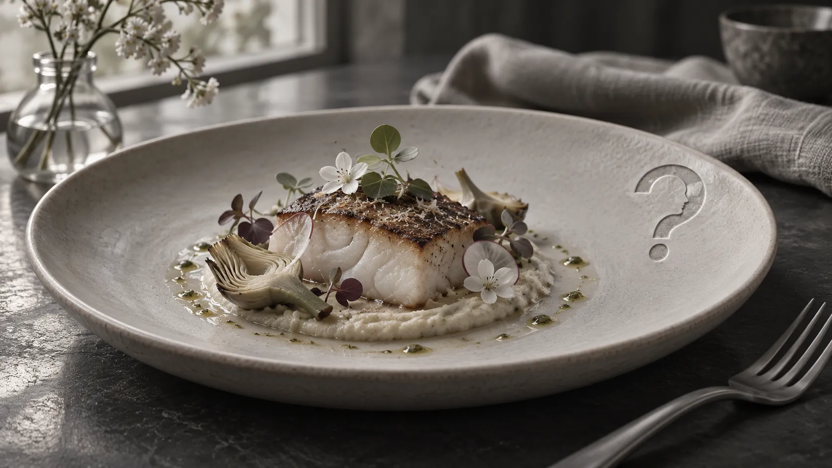
Shape, label and plate set an expectation before the first bite. Studies of packs, plating, tasting and four countries show how far those cues reach and where they need local testing.
Answer to the question
Food branding agency: does taste start with the eye?
A food branding agency works with a real effect: visual cues set expectations that shift perceived taste. Round shapes were linked with sweet and angular shapes with bitter, an art-inspired plate was rated tastier, and visual and verbal cues distorted taste discrimination. Matches differed between four countries, so cues need local testing.
Key takeaways
- Charles Spence and Mary Kim Ngo (2012) reviewed evidence that people link sweet with round shapes and bitter or carbonated with angular ones, and that pack shape can change perceived sensory qualities and liking.
- In a 2014 study led by Charles Michel, a salad arranged like a painting was liked and valued more before eating and rated tastier after eating than a tossed or a neat plate.
- JoAndrea Hoegg and Joseph Alba (2007) found, across three experiments, that common visual and verbal cues produced consistent distortions in taste discrimination, and that cues act on discrimination differently from preference.
- Xiaoang Irene Wan and colleagues (2014) asked 452 participants from four countries to match colours, shapes and textures to tastes: some matches were shared, and the overall patterns differed considerably by country.
- Pepe Martínez's The Consumer Mind describes perception as constructed rather than received, which fits the case for testing food cues with the people who will buy the food.
The same salad was rated tastier when it was plated like a painting, and a food branding agency works on that gap between what is seen and what is tasted. Pepe Martínez's The Consumer Mind describes perception as something the mind builds rather than receives, and food is a tidy place to watch that happen. Researchers call the habit of linking a quality in one sense with another a crossmodal correspondence. People match sweet tastes with round shapes and bitter or carbonated ones with angular shapes, and Charles Spence and Mary Kim Ngo argue that food labels and packaging already lean on those pairings.
How pack shape sets up expectations of taste
Spence and Ngo reviewed recent research and examples from industry on what they call shape symbolism, and discussed the explanations proposed for it. People reliably link tastes, carbonation and texture with abstract shapes that differ in how angular they are: sweet items go with circles, bitter and carbonated items with triangles and stars. Because people tend to prefer products that meet their expectations, the authors propose that companies can use these links deliberately, and that the pairings may set up expectations about taste before anyone opens the pack. They also summarise evidence that the shape of a pack can change how a product's sensory qualities are perceived and how much it is liked, with the product itself unchanged.
A label works as a promise of this kind. A rounded pack and an angular pack say different things about taste before a word is read, and the food then has to keep the promise. For wider reading on expectations built from cues outside the food, Piqueras-Fiszman and Spence published a 2015 review on extrinsic cues and sensory expectations. Colour, naming and the pack as a whole each have their own research, set out in [does yellow really make people hungry](https://thewhyweproject.com/articles/does-yellow-really-make-people-hungry), [do fancy colour names sell more](https://thewhyweproject.com/articles/do-fancy-colour-names-sell-more) and [packaging psychology](https://thewhyweproject.com/articles/branding-and-packaging-design-agency).
What diners expect from a dish before the first bite
Charles Michel and colleagues, Spence among them, tested presentation directly in a 2014 study in the journal Flavour. The same salad came in one of three arrangements: a simple tossed plate, a layout resembling a Kandinsky painting, and a neat arrangement that was not artistic. Diners completed questionnaires before and after eating. Before tasting, the painting-style plate was seen as more artistic and more complex, was liked more than the other two and was valued more highly. After eating, it also received higher tastiness ratings, and the authors conclude that attractive presentation can improve the dining experience, particularly the perceived flavour.
The order of the measurements is the useful detail, since liking and value were recorded before the first bite and the tastiness rating came after it. Anyone who styles a dish for a menu, a pack or a delivery screen is shaping the expectation against which the dish will be tasted. Diners rated one dish in that work and nobody bought anything, so it describes an experience and cannot forecast sales.
A cue earns its place only when the product delivers the taste it promises. A rounded pack on a sharp-tasting product sets up a mismatch between what the eye expects and what the mouth finds, and a short pre-test with a food branding agency can catch that before launch. The way colour on the plate or the wall shifts choice is in [red in branding](https://thewhyweproject.com/articles/red-color-psychology).
Do cues change what people can tell apart?
Telling similar tastes apart sits behind many buying decisions, and consumer researchers had rarely studied it. JoAndrea Hoegg and Joseph Alba ran three experiments, published in the Journal of Consumer Research in 2007, and found that common visual and verbal cues produced consistent distortions in taste discrimination. A subtle cue that carried no evaluation moved perception more than an obvious, well-known cue that did, and cues affected discrimination differently from the way they affected preference.
Two points follow for anyone briefing a food branding agency on a pack. A cue does not need to announce a quality to work, so a colour or a descriptive word may matter more than a claim of excellence. And because the route from cue to perception differs from the route from cue to preference, a test that asks which version people like does not show what they notice. Each needs its own measure in a good food branding agency process. A tasting table beside the design studio does this well, because the same food can be tried in different wrappers, which separates the effect of the cue from the effect of the food.
Which colours and shapes suggest which tastes by country
A cross-cultural study led by Xiaoang Irene Wan asked 452 participants from four countries to match 11 colours, 15 shapes and 2 textures with the five basic tastes, bitter, salty, sour, sweet and umami, and to rate their confidence in each match. Several colours and shapes were matched with particular tastes in all four groups, and the colour white and the textures were linked with salty. The patterns also differed considerably between countries, and the differences did not simply follow an East and West divide. The authors conclude that cultural background shapes crossmodal correspondences, though the images were shown online, so what they measured was association with a picture and not a tasting.
For a brand entering a new market, shared associations give a starting point and the differing ones give a reason to test. A food branding agency with a regional brief can repeat a short matching task with local participants before a palette or pack shape is fixed. The same idea runs through Martínez's account of perception: what a pack suggests depends on what the viewer brings to it.
| Stage | Cue | What the research measured |
|---|---|---|
| On the shelf | Pack and label shape | Perceived sensory qualities and liking (Spence and Ngo, 2012) |
| On the plate | Art-inspired arrangement | Expected value and liking before eating, tastiness after (Michel and colleagues, 2014) |
| At the first taste | Visual and verbal cues | Distortions in taste discrimination (Hoegg and Alba, 2007) |
| Across markets | Colours, shapes, textures | Taste matches by country (Wan and colleagues, 2014) |
Read down the table and the cues run in the order a buyer meets them. The matching task is the cheapest of the four for a food branding agency to run, since it needs only local participants, a set of shapes and colours, and the five tastes to choose from. The agency can present the answers to the brand team and set them against the product, and where the two disagree, the pack is the part to change first. Each of the three tests can run with a small panel of local buyers, so the brand learns from the people it hopes to serve before a pack is printed.
Common questions
Food branding agency: does taste start with the eye?
Visual cues set expectations that shift perceived taste. Round shapes were linked with sweet and angular shapes with bitter, an art-inspired plate was rated tastier, and visual and verbal cues distorted taste discrimination. A food branding agency can use these cues, and test them with the people who will buy the food.
Does the shape of a pack change how food tastes?
A 2012 review by Spence and Ngo summarises evidence that pack shape can change how a product's sensory qualities are perceived and how much it is liked, even when the product stays the same.
Do the same colours suggest the same tastes everywhere?
Not entirely. In a study of 452 participants from four countries, several colours and shapes were matched with the same tastes in every group, while the overall patterns differed considerably between countries.
Does plating change how food is rated?
In a 2014 salad study, the painting-style arrangement was liked more and valued more before eating and rated tastier after it, compared with a tossed plate and a neat plate.
Sources
Martínez, P. The Consumer Mind. Seed book; vault hub Books/The Consumer Mind.
Spence, C., & Ngo, M. K. (2012). “Assessing the shape symbolism of the taste, flavour, and texture of foods and beverages.” Flavour, 1, 12. doi:10.1186/2044-7248-1-12 https://doi.org/10.1186/2044-7248-1-12
Michel, C., Velasco, C., Gatti, E., & Spence, C. (2014). “A taste of Kandinsky: assessing the influence of the artistic visual presentation of food on the dining experience.” Flavour, 3, 7. doi:10.1186/2044-7248-3-7 https://doi.org/10.1186/2044-7248-3-7
Hoegg, J., & Alba, J. W. (2007). “Taste Perception: More than Meets the Tongue.” Journal of Consumer Research, 33(4). doi:10.1086/510222 https://doi.org/10.1086/510222
Wan, X., Woods, A. T., van den Bosch, J. J. F., McKenzie, K. J., Velasco, C., & Spence, C. (2014). “Cross-cultural differences in crossmodal correspondences between basic tastes and visual features.” Frontiers in Psychology, 5, 1365. doi:10.3389/fpsyg.2014.01365 https://doi.org/10.3389/fpsyg.2014.01365
Piqueras-Fiszman, B., & Spence, C. (2015). “Sensory expectations based on product-extrinsic food cues: An interdisciplinary review of the empirical evidence and theoretical accounts.” Food Quality and Preference, 40. doi:10.1016/j.foodqual.2014.09.013 https://doi.org/10.1016/j.foodqual.2014.09.013