Why You and I See Different Colours
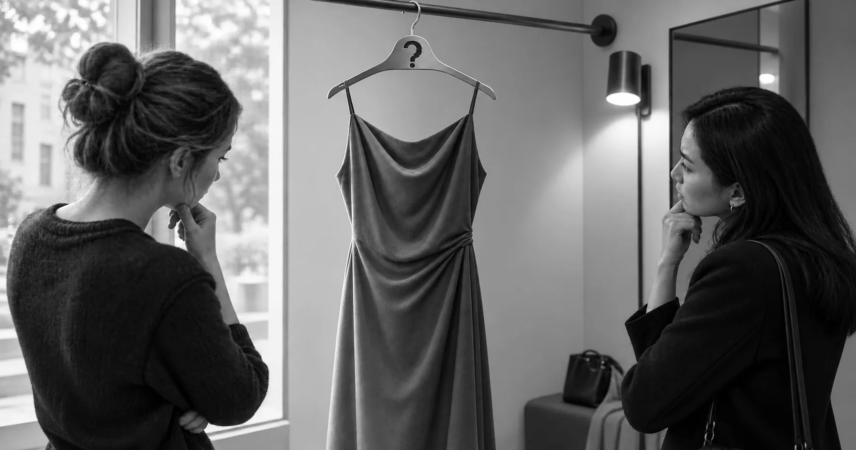
The dress photograph was not an illusion and nobody was seeing it wrong. It exposed a calculation your visual system performs constantly, gets no feedback on, and does differently from the person next to you.
Key takeaways
- The pixels in the dress photograph are brown and blue. Most people report white and gold or blue and black, and a smaller group reports blue and brown, which is what is actually there.
- Colour constancy is the calculation behind it: light reaching your eye is surface colour multiplied by illumination, and your brain has to estimate the illumination and subtract it.
- The photograph gives almost no cues about the light, so people fall back on their own default assumption. Add cues about the illumination and you can flip what somebody sees.
- It does not reveal a personality type. Witzel and colleagues found the dress result held but was unrelated to individual differences in any other ambiguous image.
- The first time you meet an ambiguous image largely fixes what you see there, and for most people it stays fixed.
You are in a shop holding a jumper you are almost sure is navy. The person with you says black. Neither of you is being difficult, and you both look up at the ceiling lights, which is the correct instinct.
Pixels
In February 2015 a photograph of a dress divided the internet into people who saw white and gold and people who saw blue and black. The explanation offered at the time was that it was an optical illusion, which is not quite right, or a trick of the image, which is closer and still misses the interesting part.
A free-response survey of 1,401 people settled the first question. Nobody was handed two options and asked to choose, and most people still said white and gold or blue and black. A smaller group said blue and brown, which is what the pixels measure as, colours associated with natural illuminants. Reports of white and gold ran higher among older people and among women. Some of those retested had switched. Asked to identify the colours from a full colour gamut instead of from words, people clustered into three peaks. The brain appears to settle on one of three stable readings and not on a smear of guesses. The work is Rosa Lafer-Sousa, Katherine Hermann and Bevil Conway, published in Current Biology that summer.
Illumination
Your visual system has a problem with no clean solution, and the photograph is a case where the problem becomes visible. The light reaching your eye from any surface is the colour of that surface multiplied by the colour of whatever is shining on it. What you want to know about is the surface. To get at it, your brain has to estimate the illumination and take it back out. That operation is called colour constancy, and it is why a white shirt reads as white under a supermarket strip light, under a sunset and under a desk lamp, even though it arrives at your eye as three noticeably different colours each time.
Most photographs hand you plenty of cues about the light. This one hands you almost none. It is overexposed, poorly white balanced, and cropped so tightly that the background says nothing.
The estimate therefore falls back on whatever your visual system assumes by default. Assume a cool bluish light of the kind that comes off a blue sky, subtract the short wavelengths, and you are left with white and gold. Assume a warm indoor bulb, subtract the long wavelengths, and you get blue and black. Assume something neutral and you see what the pixels are, blue and brown. That was the proposal from the Current Biology group, and the test of it is that adding obvious cues about the illumination back into the image flips which colours a person sees. It does.
Nobody is seeing it wrong. Two visual systems are solving the same equation with different starting assumptions.
Priors
The natural next thought is that this reveals a type of person, one who assumes daylight and one who assumes lamplight. That thought has been tested carefully enough to be abandoned. Christoph Witzel, Kevin O'Regan and Sabrina Hansmann-Roth reanalysed two earlier dress experiments and then ran two online surveys, measuring how people perceive a range of ambiguous images alongside their colour constancy, their gloss perception, the point at which a grey looks neutral to them, and how they name colours. The dress result held up. How you see it is strongly related to your individual colour constancy, and it does come down to implicit assumptions about illumination.
Everything else fell apart. Individual differences in the other phenomena were independent of the dress and independent of each other. No general perceptual style exists that you have and I lack. What exists is one specific computation, about light, in which people genuinely differ, and no evidence that it predicts anything else about how you see. Preference is a separate matter from perception, and an article on whether [men and women have different colour preferences](https://thewhyweproject.com/articles/men-women-colour-preferences) covers it.
A different group came at it with clinical colour vision tests. Among fifty-two observers, roughly two in five saw white and gold, three in ten saw blue and black, and the rest saw some other combination. Every difference that reached significance involved blue. People who saw white and gold needed more blue in a light before they would accept it as white, and their colour matches for the bright part of the image formed two clusters lying along the range of colours that daylight actually takes. Cláudia Feitosa-Santana and colleagues also tested chronotype, the morning person and evening person idea that circulated widely at the time. Blueness is what their significant results involved.
Stability
The last finding is the one that unsettles people, and it concerns not what you see but when it got decided. Work by Leila Drissi-Daoudi and colleagues had already shown that the first time you meet the image largely fixes what you see there, in the manner of one-shot learning. Extending the question to a second ambiguous photograph, this one of a shoe, they found the same thing and something worse. Covering parts of the image biased what people saw. When the covers came off, most observers carried on seeing what they had been steered into. Tracked over fourteen days, a few switched. For most, the percept simply held.
Your reading of that photograph was set, more or less, by the accident of how you first met it.
Screens
Every product photograph is an image of a surface under a light, taken by a camera that made its own estimate of that light, shown on a screen that made another, in a room whose lighting you have never once thought about. A paint chip in a showroom is being judged under the showroom's lights. The jumper in the shop is under a colour temperature somebody selected because it made the stock look good.
None of that is deception. It is the same equation being solved with different inputs at every stage, and the answer keeps moving accordingly.
The useful habits are small and they work. Judge a colour under the light it will live in. Carry the jumper to the door. Put the paint sample on the wall and look at it at three different times of day. And treat a disagreement about a colour as information about the light, not as a fault in the other person.
Perception is not a window. It is a working estimate, made from insufficient evidence and held far too confidently.
Sources
Lafer-Sousa, R., Hermann, K. L., & Conway, B. R. (2015). 'Striking individual differences in color perception uncovered by the dress photograph.' Current Biology, 25(13), R545-R546.
Witzel, C., O'Regan, J. K., & Hansmann-Roth, S. (2017). 'The dress and individual differences in the perception of surface properties.' Vision Research, 141, 76-94.
Feitosa-Santana, C., Lutze, M., Barrionuevo, P. A., & Cao, D. (2018). 'Assessment of #TheDress with traditional color vision tests: perception differences are associated with blueness.' i-Perception, 9(2).
Drissi-Daoudi, L., Doerig, A., Parkosadze, K., Kunchulia, M., & Herzog, M. H. (2020). 'How stable is perception in #TheDress and #TheShoe?' Vision Research, 169, 1-5.
Witzel, C., & Gegenfurtner, K. R. (2018). 'Color perception: objects, constancy, and categories.' Annual Review of Vision Science, 4, 475-499. doi:10.1146/annurev-vision-091517-034231.
A note on what is not claimed here: the chronotype explanation that circulated widely in 2017 is not supported by anything cited above. Feitosa-Santana and colleagues measured chronotype, and the differences they report as significant all involve blueness.