Why Your Coffee Tastes Different in a White Cup
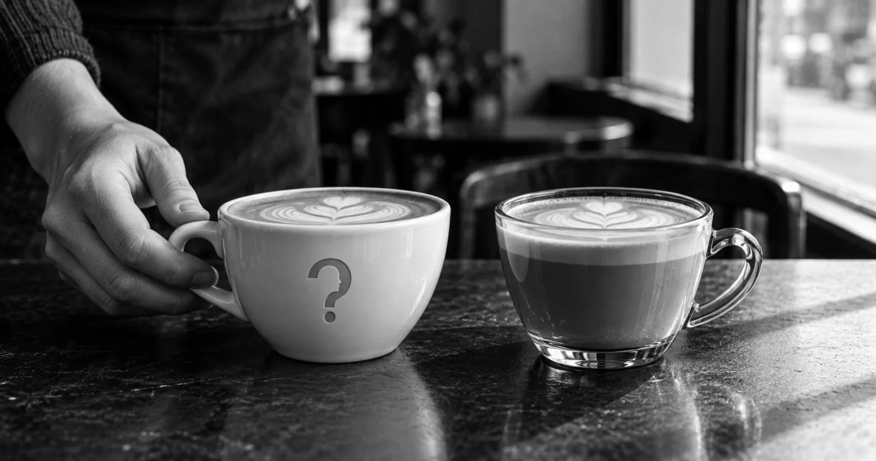
The colour of the cup changes what the coffee tastes like, and that is not a party trick. Here is the twenty-year research programme behind it, the restaurant study that tested it properly, and why the advice sold on top of it goes further than the evidence does.
Key takeaways
- Colour is the strongest single cue for setting expectations about how food and drink will taste, according to Charles Spence's review of the field.
- The same café latte was rated less sweet from a white mug than from a transparent or blue one, in a study repeated with identical mugs wearing coloured sleeves.
- The likely mechanism is contrast, not colour having intrinsic flavour. A white mug changes how brown the coffee looks, and that changes how strong and sweet it seems.
- Plate colour and shape interact instead of adding up, so the simple rules the trade press publishes are not in the research.
- Tested on real diners in a real restaurant, plate colour still moved how the food was perceived, consistently within each dessert but not uniformly across them.
You have been treating the cup as packaging. It is closer to an ingredient.
The cheapest way to check is a bag of coffee, two mugs and five minutes. Pour the same coffee into a white mug and a clear glass, taste them one after the other, and decide which is sweeter. Most people can pick one. They are drinking the same liquid.
Is this a real effect or a party trick?
Real, and about two decades old as a research programme. Its home is a laboratory at Oxford run by Charles Spence, whose subject is what he calls crossmodal correspondences, the associations that run between one sense and another. His summary of the food case is blunt: colour is the single most important product-intrinsic sensory cue for setting expectations about how something will taste. An expectation, though, is not a verdict. Where the colour matches the taste, the expectation carries through into the experience. Where it does not, you get what the papers call a negatively valenced disconfirmation of expectation, or, in ordinary language, a perfectly good drink you did not enjoy.
The study to know by name involves café latte served from mugs that were transparent, white or blue. In the first experiment the white mug made the coffee read as more intense. The mugs differed slightly in shape, so the whole thing was run again using identical glass mugs wearing coloured sleeves, and the effect held: less sweet from the white mug than from the transparent or blue ones. That is George Van Doorn, Dianne Wuillemin and Spence, writing in the journal Flavour in 2014.
Contrast is their explanation. A white mug changes how brown the coffee looks, and how brown the coffee looks feeds into how strong and how sweet it seems. You can test that one on yourself, which is more than most of [consumer psychology](https://thewhyweproject.com/articles/what-is-consumer-psychology) offers. Cutlery does it too. Vary the weight, size, shape and colour of plastic cutlery, as Vanessa Harrar and Spence did, and yoghurt comes out denser and more expensive from a lighter spoon. The colour of the cutlery moved taste ratings only in combination with the colour of the food. Food eaten from a knife was rated saltiest of all. The pattern that ties those together is disconfirmed expectation: the effects show up most strongly when the object in your hand is not the object you were braced for.
Where does the argument actually sit?
Not over whether it happens. Nobody serious disputes that. The argument is about whether it survives a real meal, and the researchers have pressed on that harder than their critics have.
Peter Stewart and Erica Goss made the plateware result more awkward. Testing cheesecake on plates varying in both colour and shape, they found that simple judgments such as sweetness and intensity moved differently from higher-level ones such as quality and liking, and that colour and shape interacted instead of adding up. White round plates raised both kinds. Black square plates raised only the second kind. Plate colour and shape influence taste, they concluded, and not in a straightforward manner.
Compare that with the version that reaches the trade press, which arrives as a rule. Use white plates. Serve it in blue glass. No such rule exists in the literature, and the people who did the work keep saying so, in the papers, in the same paragraphs that get quoted for the opposite purpose.
The container is already part of the product. The only question is whether anybody chose it.
Spence's own review carries the qualifications that fall off in transmission. Food colours mean different things at different ages and in different cultures. Taster status, which is partly genetic, changes how strongly colour moves what a person reports. A universal palette is not compatible with any of that, and all of it sits in the paper most often cited to sell one.
What happens outside the laboratory?
Three desserts, a white plate or a black one, and a real restaurant full of people who had come out to eat. The design was between-participants, so no diner saw both plates and nobody could work out what was being measured. Plate colour significantly influenced how the food was perceived. The size of the shift varied by dessert, and simple contrast could not account for all of it, since associations such as black with intense or sophisticated chocolate appeared to be carrying some of the load. This is Betina Piqueras-Fiszman, Agnès Giboreau and Spence, and it is the most ecologically honest test the field has run.
The detail that makes it useful is the consistency. For each dessert, the same plate produced the higher scores on every attribute rated. The effect did not scatter into noise the moment it left the booth. It held in a loud room, with complex food, among people who were not thinking about it.
So: the effect generalises, it is not large, and it is not uniform across dishes. That is what a real effect looks like when it is finally measured somewhere untidy. Colour is also said to switch on appetite itself, and one article checks whether [yellow really makes people hungry](https://thewhyweproject.com/articles/does-yellow-really-make-people-hungry).
What is actually at stake
Our position is that the mechanism is understood well enough to use and nowhere near well enough to systematise, and that almost everything sold on the back of it lives in that gap. There is no wavelength that means sweet. What exists is a relationship between how food looks against its background and what your brain predicts before the first mouthful. The same white mug that suppresses sweetness in coffee will do something else entirely with a pale dessert, because the contrast has reversed. A colour chart with taste words printed beside it is a simplification of somebody else's careful work, and the careful work says the answer depends on the dish.
At home the use is small and immediate. Thin coffee, try a different mug. For anyone selling, the gap is the whole point. Two cafés can serve coffee from the same roaster, brewed the same way, and hand their customers measurably different experiences, and only one of them will be able to say why. The findings have been public for over a decade and cost nothing to apply. What they ask for is not a budget. They ask somebody to treat the crockery as a decision.
Sources
Spence, C. (2015). 'On the psychological impact of food colour.' Flavour, 4, 21. Colour described as the single most important product-intrinsic sensory cue for setting taste and flavour expectations; mismatch produces a negatively valenced disconfirmation of expectation; effects vary by age group, culture and taster status. doi:10.1186/s13411-015-0031-3
Van Doorn, G., Wuillemin, D., & Spence, C. (2014). 'Does the colour of the mug influence the taste of the coffee?' Flavour, 3, 10. White mug enhanced rated intensity against a transparent mug; in the second experiment, using identical glass mugs with coloured sleeves, coffee was rated less sweet in the white mug than in the transparent and blue ones. Simultaneous contrast was ruled out. doi:10.1186/2044-7248-3-10
Harrar, V., & Spence, C. (2013). 'The taste of cutlery: how the taste of food is affected by the weight, size, shape, and colour of the cutlery used to eat it.' Flavour, 2, 21. Yoghurt denser and more expensive from a lighter spoon; cutlery colour effects depended on food colour; food rated saltiest from a knife. doi:10.1186/2044-7248-2-21
Stewart, P. C., & Goss, E. M. (2013). 'Plate shape and colour interact to influence taste and quality judgments.' Flavour, 2, 27. Elemental judgments raised by white round plates; compound judgments also raised by black square plates; the authors conclude the influence is not straightforward. doi:10.1186/2044-7248-2-27
Piqueras-Fiszman, B., Giboreau, A., & Spence, C. (2013). 'Assessing the influence of the color of the plate on the perception of a complex food in a restaurant setting.' Flavour, 2, 24. Three desserts, white or black plate, between-participants, in a real restaurant; plate colour significantly influenced perception, varying by dessert, with colour-flavour associations implicated alongside contrast. doi:10.1186/2044-7248-2-24
Spence, C. (2011). 'Crossmodal correspondences: A tutorial review.' Attention, Perception & Psychophysics, 73(4), 971-995. doi:10.3758/s13414-010-0073-7